


Published: .
Technical writers are increasingly looking for efficient HAT (Help Authoring Tools) systems. Two established solutions are the popular Austrian software Help+Manual and the alternative Dr.Explain. Let's compare them across several important aspects: interface, tools, technical parameters, performance, reviews, checklist and final verdict.
We start with the visual part.
Interface comparison
A clear, organised interface determines how quickly you can learn the tool, how comfortable you feel using it, and overall efficiency. The makers of Help+Manual and Dr.Explain took different design approaches. Let's begin with the start screen.
Help+Manual: "Learning ecosystem"
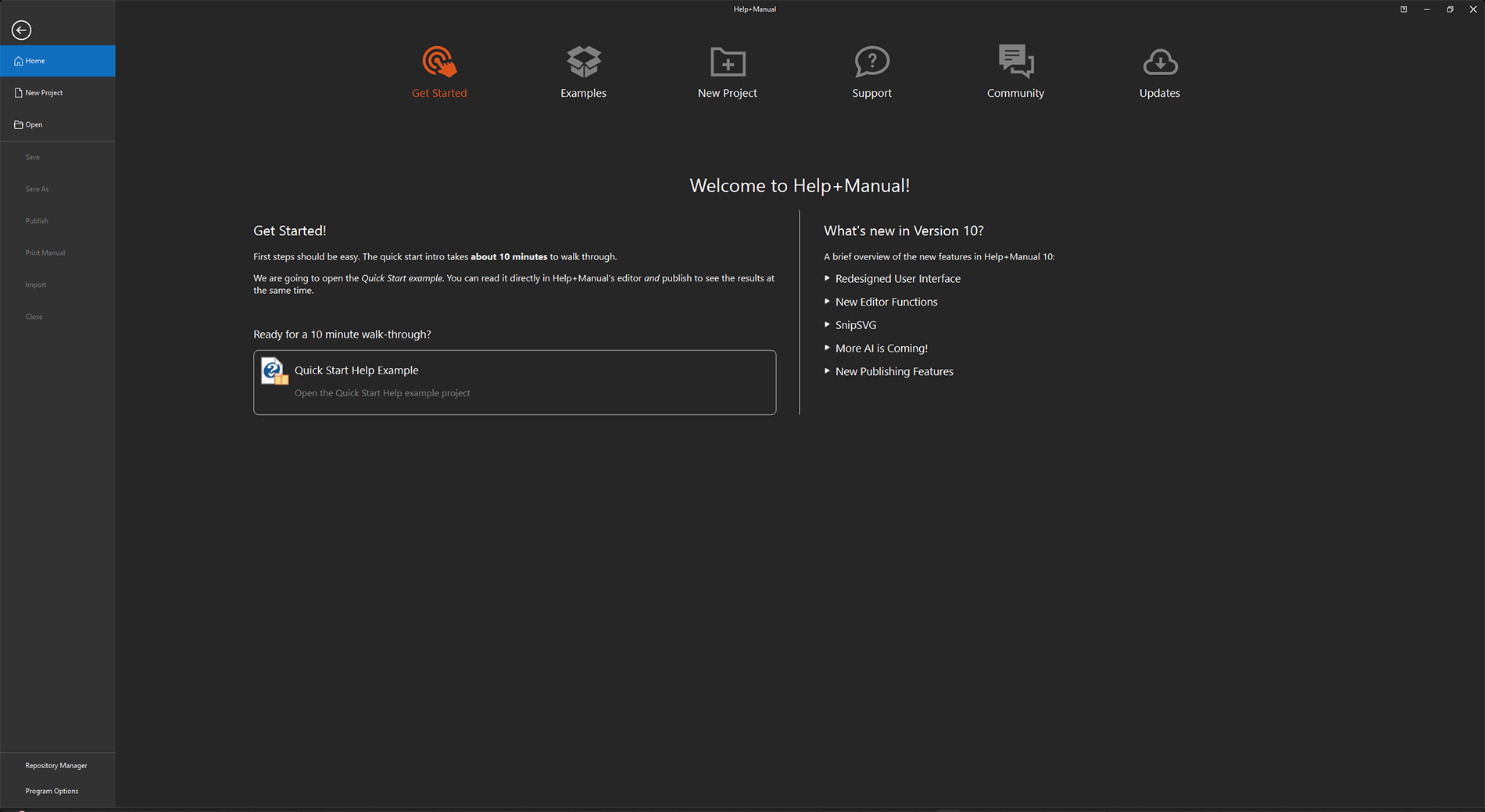
Help+Manual start screen is designed as an onboarding dashboard. The designers wanted to lower the "fear of the blank page" for novices and immediately engage them through ready‑made examples.
Hierarchy and focus
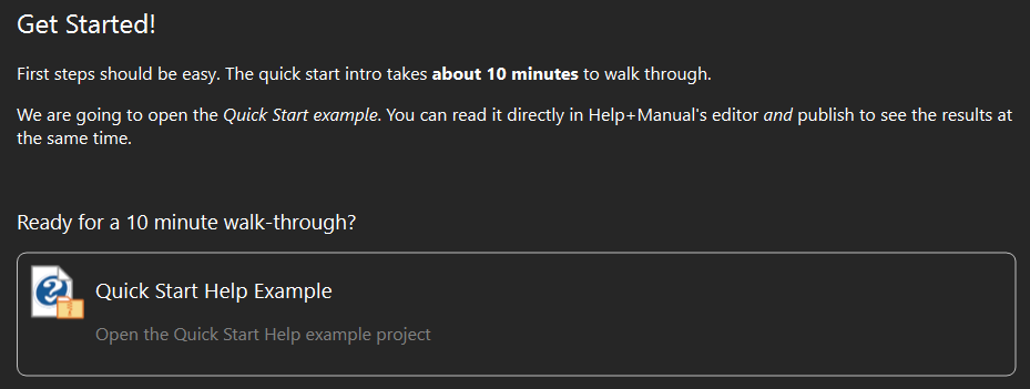
- Primary focus (attention anchors): top navigation bar with the orange "Get Started" tab. Orange on a dark background is a powerful accent. Also the large "Quick Start Help Example" card – the biggest visual element, the main call to action.
- Secondary focus (information layer): the "What's new in Version 10" block on the right. It is balanced in size with the learning block but does not conflict (no accent colour). Intended for retaining experienced users.
- Tertiary focus (navigation): the left panel and top icons (Examples, New Project, Support). They are neutral and secondary for a user who hasn't started working yet.
The interface is minimalistic, the dark theme reduces eye strain (UI theme follows your operating system settings). The strategy is "learning by practice". At launch, the program suggests starting with a tutorial:
Dr.Explain: "Functional dashboard"
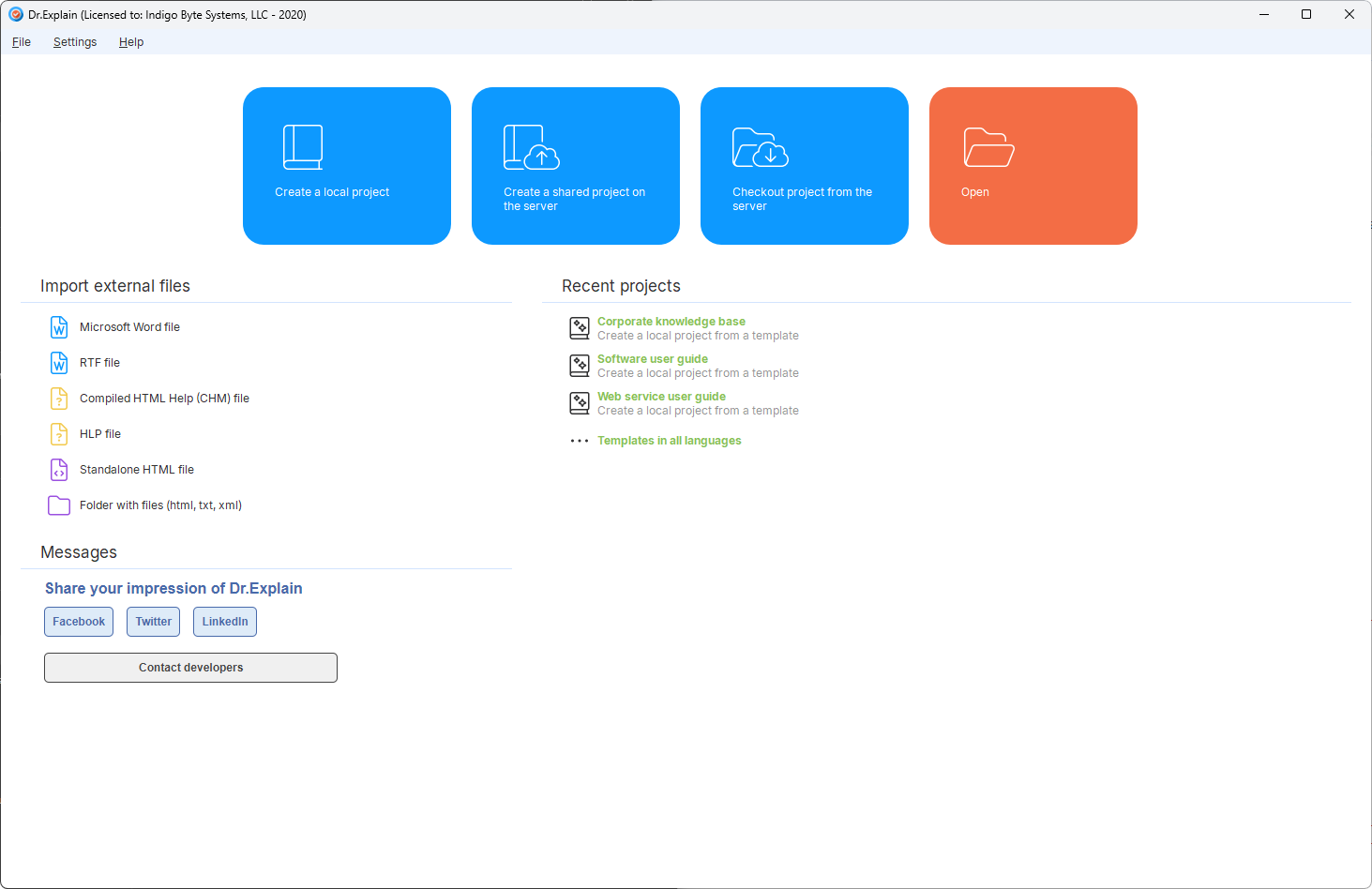
This is a pragmatic, tool‑oriented approach. The focus is not on learning but on completing routine tasks as quickly as possible. Unfortunately, Dr.Explain does not have a dark theme.
Hierarchy and focus
- Primary focus: four large cards at the top. Colour coding (blue for create, orange for open) immediately conveys the action. These blocks dominate the window. The user sees entry points for every workflow.
- Secondary focus (working context): the "Import external files" list on the first screen – the main helper for data migration and modernisation of existing help documentation.
- Tertiary focus: the top menu "File/Settings/Help" – standard, familiar, doesn't require attention at launch.
The interface starts with the question "What do you need to do right now?" – no learning blocks. This is design for professionals who start the program many times a day. A clear boundary between the creation area (buttons) and management area (import/recent projects) makes navigation intuitive.
Comparative table: interface approaches
The table below compares key UX characteristics. It will help you decide which tool better suits your tasks and team's skill level.
Now let's look at the main editor windows.
Help+Manual: classic approach
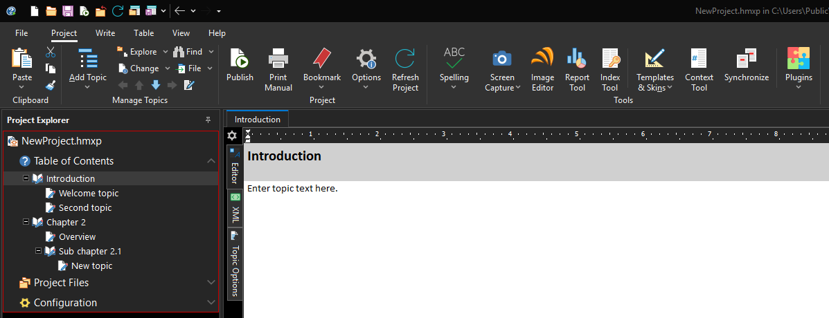
Help+Manual's interface follows Microsoft Office traditions, using a ribbon UI. It is familiar to MS Word users. Tools are grouped, making it easy to find what you need. Emphasis is on the familiar writing process.
Dr.Explain: focus on structure and properties
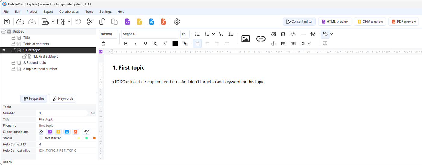
Dr.Explain uses a more compact, modern approach. The topic properties pane is not hidden in a menu – it's always visible but placed at the bottom:
This emphasises that in Dr.Explain, working with metadata, Help Context IDs, and topic settings is a priority – especially convenient for creating context‑sensitive help for software.
Comparative table: interface features
| Parameter | Help+Manual | Dr.Explain |
|---|---|---|
| Interface paradigm | Classic ribbon (Ribbon UI) | Toolbar with context‑sensitive tabs |
| Main focus | Text editing, visual layout | Project structure, metadata and topic properties |
| Property management | Menus/dialogue windows | Dedicated panel at the bottom of the screen |
| User feeling | "Like Word": comfortable, many buttons | "Specialised tool": strict, functional |
| Learning curve | Low (for Office users) | Medium (requires understanding of project structure) |
Both tools approach the first‑contact problem differently. Help+Manual relies on ready‑made examples and an onboarding dashboard, helping a beginner quickly grasp the logic. Dr.Explain does not overload the start screen – four large action cards answer the question "Where to start?" This works for both beginners (no need to search menus) and experienced users (everything at hand). Help+Manual provides a smooth entry for those used to Office‑like interfaces. Dr.Explain gives a quick start without training, yet does not sacrifice depth – property panels and context tabs allow fine‑tuning when needed.
Tools
Now that the programs are running, let's look at the tools they offer.
Screenshot annotation
We start here because annotating interfaces is very time‑consuming and interests many people.
Help+Manual lacks automatic screenshot annotation. All illustrations must be created manually – either with the built‑in SnipSVG editor or external tools like Snagit. The process: take a screenshot with an external tool, draw callouts and labels manually, save, import into the project, then insert into the topic. This gives full control over each illustration’s appearance but requires significant time. For projects with hundreds of screenshots, this can become a bottleneck. The difference is especially noticeable when the interface changes: with Dr.Explain you just recapture the window and the program reapplies annotations; with Help+Manual you would have to redraw each illustration manually.
Dr.Explain solves this radically: when capturing an application or web page window, it automatically recognises interface elements – buttons, input fields, menus, switches – and immediately creates numbered annotations on them. Using built‑in algorithms, it analyses the window structure and generates a ready‑made annotated illustration. The technical writer only needs to add explanatory text to the markers. You can selectively annotate separate areas or capture the whole window. If necessary, you can delete extra elements, scale, crop, add or remove controls. This turns illustration creation from many hours of manual labour into a quick, almost effortless action.
Text editor
The heart of any HAT is the content editor. Its convenience determines how comfortable the technical writer is with text, tables, multimedia, and other elements.
Help+Manual uses a classic ribbon interface reminiscent of Microsoft Word. Users familiar with office suites feel confident right away. The editor supports full text formatting, insertion of tables, images, videos, links, as well as HTML code editing for fine‑tuning. Styles and themes are organised well: you can unify the design of all sections and change it quickly when needed. The main advantage is familiarity – a beginner does not have to retrain if they already used text processors. However, due to the abundance of functions and settings, the interface can feel overloaded, and some specific capabilities (e.g., interactive elements or conditional content) are hidden in non‑obvious places.
For instance, to insert conditional text, a novice has to find the "Write" tab, then the "More" dropdown, then select "Condition", and only then define the conditions. In Dr.Explain the analogous function (conditional inclusion/exclusion of blocks) is implemented through the topic properties pane, which is more intuitive.
In Help+Manual, many functions are spread across different ribbon tabs (Project, Write, Table). A new user may take time to find where to enable line numbering or insert conditional content. Icon sizes on the toolbars are fixed, which may be uncomfortable on high‑resolution screens.
Dr.Explain offers a more compact and modern editor, oriented toward project structure rather than visual embellishment. It supports everything needed to create documentation: text formatting, tables, lists, insertion of images, videos, links, and special objects. The toolbar is optimised for convenience and not overloaded with unnecessary buttons. Styles and themes allow you to quickly unify all sections. Like Help+Manual, Dr.Explain supports variables – you can set a product version, support address, or other frequently repeated values or text. The editor focuses on efficiency: fewer distracting elements, more space for content.
Regarding interactive elements – tabs, accordions, tooltips – both tools support them differently. In Help+Manual, creating such elements usually requires manually inserting HTML code or JavaScript, or using ready‑made skins with interactivity support. The documentation is detailed, but a novice may need time to learn. Dr.Explain has no built‑in ready‑made blocks for tabs or accordions, but you can add arbitrary HTML code and use the built‑in preview to verify. Both tools can achieve the desired result, but with different levels of complexity.
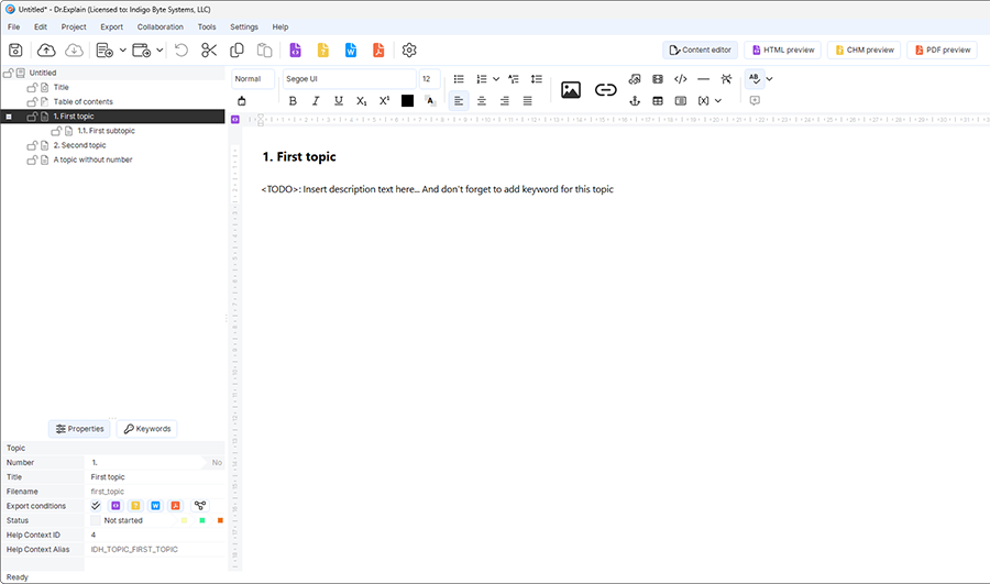
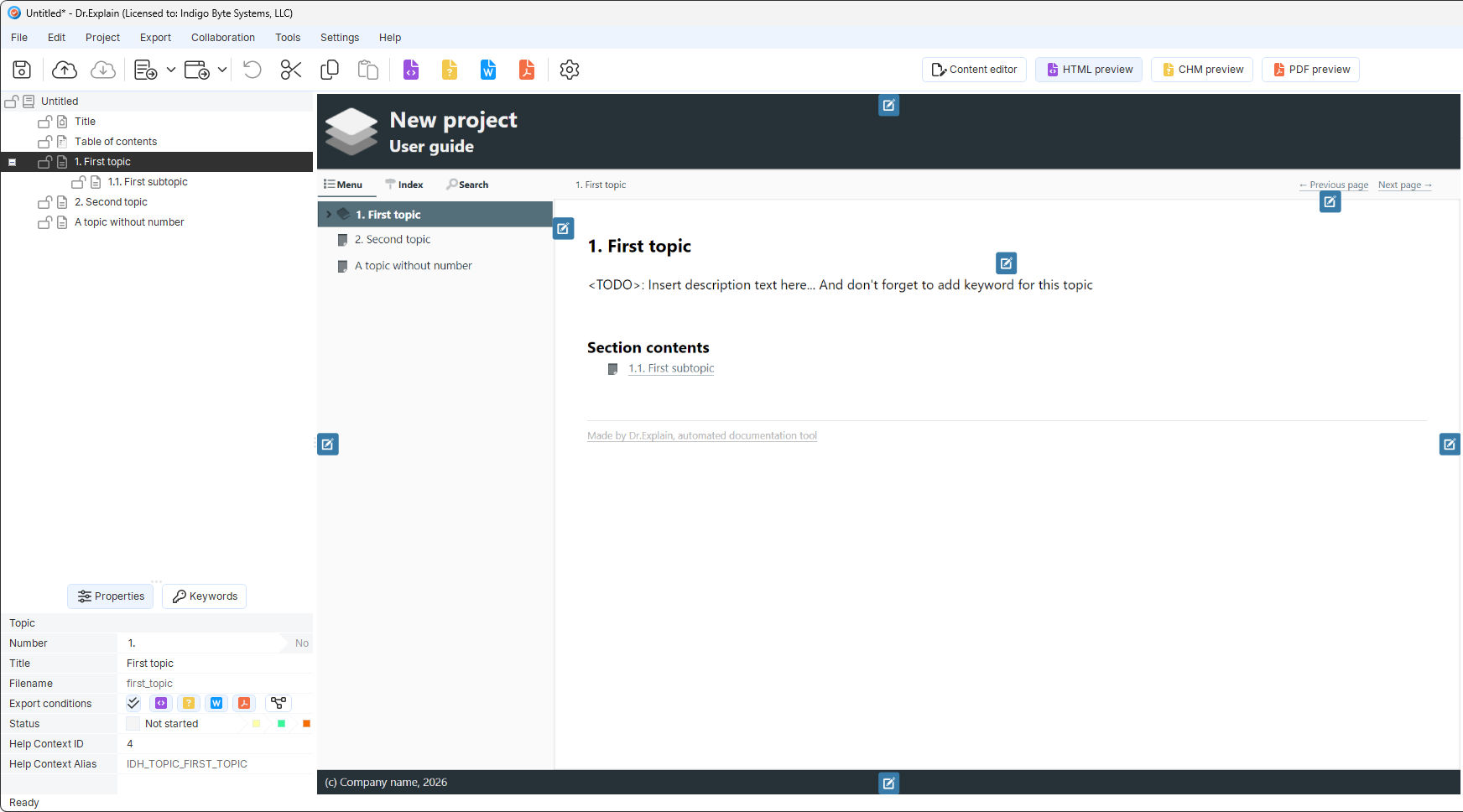
Dr.Explain’s preview mode lets you see changes without exporting the project:
The key difference: Help+Manual offers a familiar, multi‑functional tool for those who value a known interface. Dr.Explain bets on minimalism and efficiency, allowing technical writers to focus on structure and content rather than buttons and settings.
Export
Output format variety is a major decision factor. The approaches differ noticeably.
Help+Manual offers an exceptionally wide spectrum of output formats. You can publish to classic CHM (Help-file), modern HTML for websites, PDF for print, DOCX for further editing, ePUB for tablets and Apple books, as well as Amazon Kindle format. Additionally, its own eWriter Help (with a separate viewer or standalone EXE) and ZipHelp – HTML files packed into an archive with an extended site map. For developers creating Visual Studio extensions, help formats for VS 2002‑2008 and VS 2010 are available. Essentially, Help+Manual covers almost any need – from classic Windows help to modern e‑books.
PDF setup in Help+Manual is done through the separate Print Manual Designer application. There you can set headers, footers, numbering, title pages, but learning the Designer interface adds another layer of complexity. In Dr.Explain, all PDF settings are in one dialogue, but customisation options (e.g., arbitrary placement of headers/footers) are more modest.
Dr.Explain focuses on the most demanded formats: CHM for application‑embedded help, HTML, DOCX and PDF for printed documentation. For most projects this set is enough. When needed, you can export from the command line – convenient for automation. Dr.Explain does not try to cover all possible formats; it concentrates on those truly needed by most users: local help for Windows apps, web help, and print documents. This is a deliberate choice towards simplicity and focus on core tasks, not chasing quantity of formats.
Help+Manual is the choice if you need non‑standard formats like ePUB, Kindle, eWriter Help or help for Visual Studio. Dr.Explain is your tool if the basics (CHM, HTML, PDF, DOCX) are sufficient and you value fast publishing without extra configuration.
Technical parameters and performance
Let's look at both tools systematically. Is Dr.Explain a full replacement for Help+Manual? The answer depends on your specific requirements.
Comparative technical table
The table below compares the two tools by key criteria: documentation approach, ease of learning, output formats, automation capabilities, and total cost of ownership. Data is based on official product documentation and user feedback.
| Parameter | Help+Manual (EC Software) | Dr.Explain (Indigo Byte Systems) |
|---|---|---|
| Documentation creation approach | Classic HAT with WYSIWYG editor, powerful CMS | Automation, unique screen annotation feature |
| Operating system | Windows (desktop app) | Windows (64‑bit 7–11, Server 2025), desktop app |
| Cross‑platform | Windows only | Windows only (64‑bit 7–11, Server 2025) |
| Cloud platform / Publishing | No own cloud platform. Publishing possible via FTP/SFTP to external server. | Cloud platform Tiwri.com for collaboration. |
| Ease of learning | Steeper learning curve due to many settings | Medium complexity |
| Output formats | CHM; HTML; PDF; DOCX; ePUB; Kindle; MS Help 2.0. | CHM; HTML; PDF; DOCX |
| Git / CI/CD support | Git integration (since version 9) | No built‑in Git support. Command‑line utility deexport.exe available. |
| TCO (license + maintenance) | Basic license from €569 (Professional – €899). Plus annual tech support renewal ~€314. | Perpetual license and annual subscription options. From $99 one‑time payment per user |
Dr.Explain can be a full replacement for Help+Manual for projects where speed and simplicity are the priority, not dozens of output formats.
Hidden collaboration complexities
Both tools allow teamwork, but each has pitfalls.
Help+Manual and Git. Although Git integration (since version 9) exists, it requires technical writers to understand version control basics. When two authors edit the same topic simultaneously, merge conflicts arise that cannot be resolved through Help+Manual's own tools – you must manually edit the topic's XML files, which can lead to errors and formatting loss. Moreover, project files (.hmxz) are ZIP archives, preventing line‑by‑line comparison. Therefore many teams using Help+Manual store only backup copies in Git and organise real collaboration via shared network folders with file locking.
Dr.Explain and shared folders. If your team has more than one technical writer, think about collaboration in advance. Dr.Explain works with the Tiwri.com platform (free tier available), but there is a limitation: when one author edits a topic, others see it as read‑only until the editing is finished. Command‑line export can be used for CI/CD.
Now let's dive into details critical for daily work. Compare both tools using Process Explorer to assess real RAM and CPU usage during intensive work.
Resource analysis via Process Explorer
The test PC: Windows 11, 16 GB RAM, Intel Core i7-4790K 4 GHz. On other configurations results may differ. Based on the Process Explorer screenshot we can draw some conclusions about architecture and resource consumption.
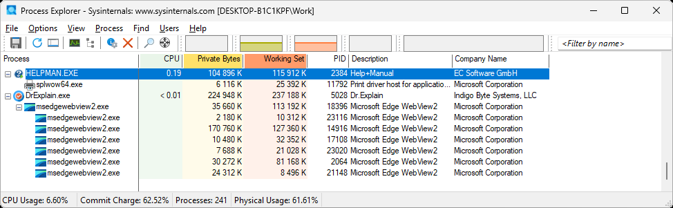
The idle‑state data clearly shows architectural differences and baseline resource usage. Load‑testing (e.g., compilation time of a large project to PDF or CHM) requires strictly controlled conditions – identical project versions, clean system restart, averaging over several runs. Such measurements are outside this overview but could be a separate study. Still, the idle snapshot is a useful starting point: it shows how many resources the program takes before any active work.
| Program | CPU | Working set (RAM, KB) | Architecture notes |
|---|---|---|---|
| HELPMAN.EXE | 0.19% | ~115,912 | "Traditional" app (Win32/native) |
| Dr.Explain.exe | <0.01% | ~237,188 | Modern app (WebView2/Chromium) |
Dr.Explain uses several child processes msedgewebview2.exe. This means the program is built on Microsoft Edge WebView2 – a modern approach that allows using web technologies (HTML/CSS/JS) for the interface. The cost is significantly higher RAM consumption. The program "bloats" because it needs to launch the browser engine for each tab or interface element.
Note that WebView2 requires Microsoft Edge (or a separate runtime) installed. On legacy Windows versions (e.g., Windows 7 without updates) or strict corporate environments with restrictions, this may cause problems. Help+Manual, as a classic Win32 application, has no such dependencies.
HELPMAN.EXE looks like a classic desktop application (likely written in Delphi, C++ or C# using native Windows libraries). It has no multiple web‑engine child processes, therefore it uses roughly half the RAM.
The choice between RAM saving (Help+Manual) and high automation (Dr.Explain) depends on your project’s priorities: if documentation creation speed is key, Dr.Explain has an edge; if minimal resource usage is critical, Help+Manual looks preferable.
Reviews
Reviews are taken from G2. The examples below are individual user experiences, not systematic analysis. Judge products from these quotes with caution. Number of reviewed testimonials: 2 for Help+Manual, 2 for Dr.Explain – they are only to illustrate possible opinions.
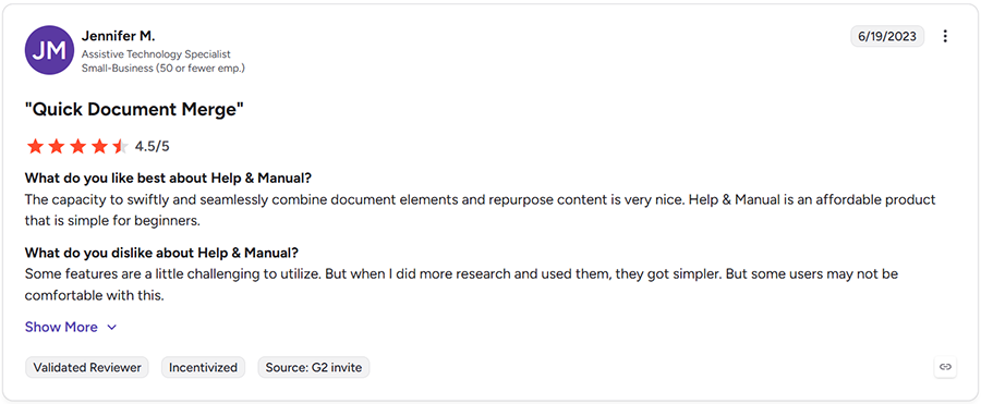
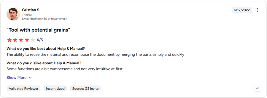
Example reviews for Help+Manual:
The capacity to swiftly and seamlessly combine document elements and repurpose content is very nice. Help & Manual is an affordable product that is simple for beginners. Some features are a little challenging to utilize. But when I did more research and used them, they got simpler. But some users may not be comfortable with this.
The ability to reuse the material and recompose the document by merging the parts simply and quickly. Some functions are a bit cumbersome and not very intuitive at first.
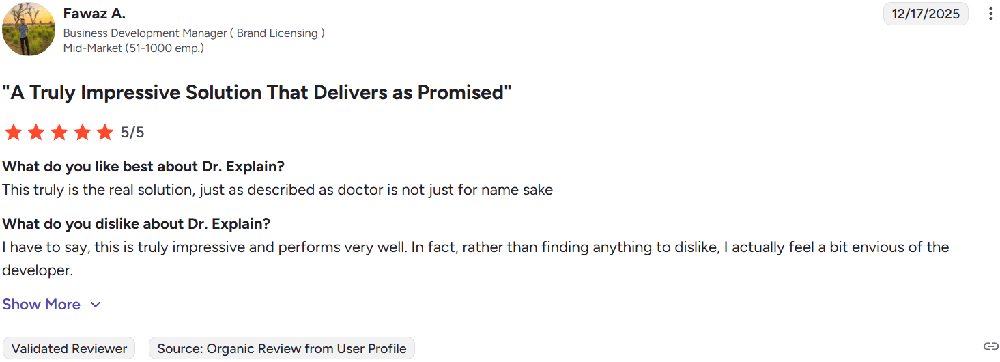
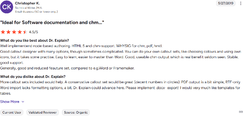
Example reviews for Dr.Explain:
This truly is the real solution, just as described as doctor is not just for name sake.
Well implementend node-based authoring. HTML 5 and chm-support. WHYSIG for chm, pdf, hmtl. Good callout designer with many options, though sometimes complicated. You can do your own callout sets, like choosing colours and using own icons, but it takes some practise. Easy to learn, easier to master than Word. Good, useable chm output which is real benefit seldom seen. Stable, good support.
Practical decision checklist
- Is your audience and team global?
- Are special output formats critical (ePUB, Kindle)?
- Do you need automatic documentation generation directly from the software interface?
- What is the budget for licensing and staff training?
- Is team collaboration via Git important?
If your priority is speed, simplicity, and cost‑effectiveness, Dr.Explain deserves attention. If you need dozens of formats and deep integration with western ecosystems, consider Help+Manual.
Conclusion
Both tools are strong solutions. Help+Manual is a powerful combine with huge functionality, but high cost and complexity. Dr.Explain bets on speed, simplicity and economy. The main criterion is how well the tool matches your specific tasks and environment where your product operates.
When evaluating Help+Manual and Dr.Explain, think of them as two distinct engineering approaches rather than just feature sets.
Help+Manual is built for complex, format‑heavy projects with tight control over every output detail. Teams that need specialized deliverables such as ePUB, Kindle, MS Help 2.0, or custom VS integration will appreciate its depth.
Dr.Explain, on the other hand, is optimized for speed and simplicity. Its instant screen annotation and streamlined workflow mean a single writer can produce polished documentation in a matter of hours. For many B2B software teams and fast‑moving product groups, this agility is a decisive advantage.
That said, the picture changes in collaborative environments. Help+Manual’s Git integration works, but teams must be prepared to resolve merge conflicts at the XML level. Dr.Explain’s optional cloud platform Tiwri.com provides a simpler shared workspace, though it restricts topics to read‑only while someone is editing them. Evaluate your team’s size and workflow before committing.
Ultimately, no tool is universally “better”. The right choice hinges on three questions:
- Do you need dozens of output formats? → Lean toward Help+Manual.
- Is rapid creation your top priority? → Dr.Explain will likely save you more time.
- How many writers will collaborate? → Map your version control or locking strategy accordingly.
Take both for a test drive with a real project. The one that fits your rhythm and removes friction is the one you should adopt.