


As you probably know, now people mostly access the Web from mobile devices like smartphones, tablets, and other gadgets. Internet-connected mobile devices are widely used not only for entertainment purposes, but also to conduct all kinds of business. A mobile application is usually available for any business process that is used by a dozen or more companies.
Today’s businesses are highly mobile and use state-of-the-art technologies. It refers to all aspects of business. Many business processes are carried out “in the field,” not in the office.
In most cases, having a business application at hand is not enough; you also need to have quick access to reference information on business processes or products. Basically, end-user documentation and technical documentation must also be available in a mobile-friendly format.
The times when all documentation was on paper or in multi-megabyte PDF files are gone. Now you also need to publish it on the Web as online help that is easy to use both on desktop computers and on any Internet-capable mobile devices.
That problem can be solved, and the solution is simpler than appears.
Using Dr.Explain is one of the simplest ways to create a mobile-friendly, professional-grade online help.
Dr.Explain allows you to create a user guide or technical documentation in multiple formats based on one project. It takes only a couple of clicks to export the documentation to one of these popular formats: PDF, CHM (the help file format used in Windows), Microsoft Word, or online help ready to publish on the Web.
In this article, we are going to focus on online help that can be accessed by your customers or colleagues from their personal computers or mobile devices after you have published it on your website. Online documentation should be easy to read and use on different mobile platforms. You can achieve that goal by employing several factors. Let’s take a closer look at them.
One Internet address and one information source
The online help viewed on personal computers and mobile devices is one and the same documentation available at one and the same Internet address. Creating separate versions of online help for desktop computers and mobile devices is ineffective for a number of reasons.
So we do not suggest that you should create a mobile version of your documentation. Instead, make sure the same online help is easy to use on a desktop computer or on a smartphone or a tablet. That’s the approach used in Dr.Explain: The application creates an online help that can automatically adapt to any screen size and platform, making it easy for the user to read the documentation.
That effect is attained by employing several factors.
Using responsive design for online documentation
Responsive design is a layout technique that guarantees that the appearance and structure of each webpage will adapt to the size of the browser window.
In most cases, a webpage that “knows” that it has been opened on a small screen will hide all secondary items: ads, headers, side panels, technical text, inessential captions, and secondary navigation elements. The responsive webpage does its best so that the precious screen space is used to display the content: text, tables, and pictures from the current section of the documentation.
Making a webpage responsive is not a trivial job. For someone who is not proficient in web programming, it is essentially an insurmountable problem. But if you use a tool like Dr.Explain to create your online help, you will not have to tackle that problem!
Online help pages generated by Dr.Explain are responsive by default.
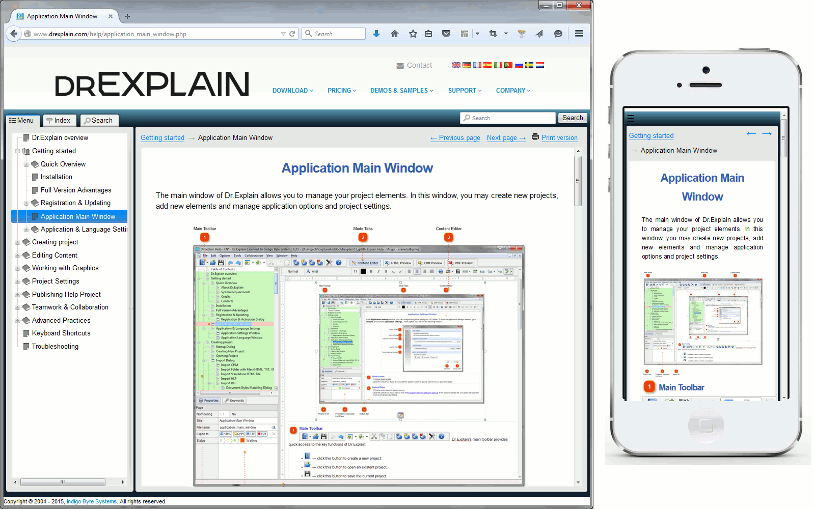
Your online help will be easy to use regardless if the user accesses it from a desktop PC or a laptop, or from a smartphone or a tablet. No additional configuration or adaptation is required on your part!
Using the screen space efficiently
When using responsive design, it is necessary not only to hide all secondary items, but also to adapt the visible ones, so that they are easy to view and use on a small screen. For example, all pictures must be automatically scaled to the browser window size. Each displayed item must be positioned in such a way that the user doesn’t have to scroll horizontally, and all essential parts of the content must be visible. There are dozens of such technical details to consider.
When developing Dr.Explain, we have taken all of them into account, so you don’t need to bother. Just focus on writing and structuring your documentation. We have already solved the problem of displaying webpages properly on screens of any size.
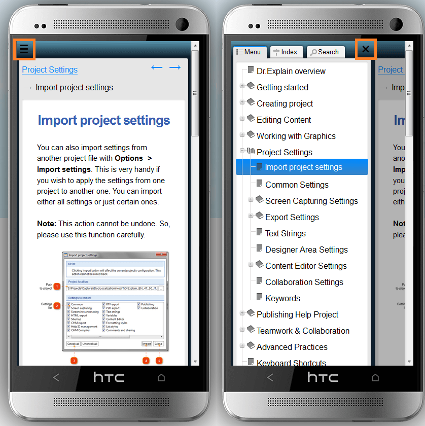
Easy navigation and reasonable interactivity of mobile navigation
Adaptation of navigation elements is another important aspect that affects the ease of use of online help on mobile devices. There are a few major rules to follow.
-
Display documentation-related navigation elements only. Any other items should be hidden, because the screen space is too precious. As a rule, the items to hide are the website’s main menu, links to pages that are not part of the online help, advertising links, etc.
-
Reduce in size any frequently-used, small navigation elements. They should occupy as little screen space as possible, because most of it is meant for the content. However, navigation elements should be large enough, so that the user can easily tap them.
The conventional approach is to replace large buttons or text links by small buttons with simplified images or by icons.
-
Hide major navigation elements that are not constantly used or occupy too much screen space, but make them easily accessible. This rule usually applies to the online help’s table of contents, search bar, and subject index.
When displaying content on a mobile device, avoid using any complex interactive or visual effects, so that the webpage is as compatible with different browsers as possible and the load on the mobile CPU is not too high.
Dr.Explain generates online help that fully conforms to these rules. Thanks to that, users can view your documentation on their devices without any additional efforts on your part.
Making the complete documentation available to download to the user’s device for offline use
The availability of online help on your website does not mean that your customers or colleagues can access the Internet at all times. For example, they may be on a long journey, their mobile provider’s roaming fees may be very high, and so on.
To be on the safe side, create a PDF file with user documentation and make it available on your website along with the online help. In that case, the users can download the file onto their devices and view it offline when necessary.
With Dr.Explain, you can easily generate the PDF version of documentation based on the same project that you used for generating the online help. You don’t have to use any additional tools or do any additional work, other than doing a few clicks.
Conclusion
Finally, think about your existing user guides, technical instructions, or other documentation, and ask yourself the following questions:
-
Can your users or colleagues easily access the documentation?
-
In which formats is the documentation available?
-
How easy is your documentation to use on desktop computers and mobile devices?
-
How difficult is it to create and maintain your documentation?
If you see that your situation is far from perfect, do not be upset. The problem is easier to solve than you might think, just start using specialized tools like Dr.Explain.
If you do that, it will be easy for you to create online help, user guides, working instructions, and help files. You will be able to focus on the description of your project or product, while the software tool will tackle all the technical stuff.