


Published: .
Creating and maintaining user documentation is a complex process. Whether you are a technical writer, a developer, or a project manager, you often face the same question: What is the current state of the documentation? Which topics are finished? Which need editing? Who is working on what? Without a clear overview, you waste hours opening each topic, scrolling through text, and manually tracking statuses.
That’s where the heatmap feature in Dr.Explain comes into play. This simple yet powerful tool transforms your topic tree into a color-coded dashboard, giving you an instant visual snapshot of your entire project. In this article, we’ll explore how the heatmap boosts productivity, why it’s essential for any user manual software, and how it integrates with other Dr.Explain capabilities like screenshot annotation and collaborative workflows.

What is a heatmap in Dr.Explain?
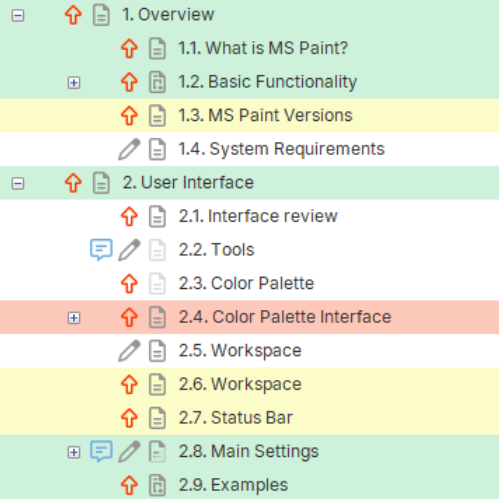
In Dr.Explain, the heatmap is the color coding of the topics. Each topic and subtopic can be assigned a status (e.g., Completed, In progress, Waiting, Not started). The status is then reflected by a color icon next to the topic name. You can see the entire project’s progress at a glance — no need to open individual topics.
This feature is especially valuable when you create user guide documentation for complex software products. Instead of relying on spreadsheets or verbal updates, you get a real-time, color-coded map of your work.
Why use a heatmap for user documentation?
Traditional help authoring tools often lack built-in progress tracking. Teams resort to external task boards or manual checklists. Dr.Explain’s heatmap integrates progress tracking directly into the project structure. Here’s why it matters:
- Instant diagnostics. Red topics immediately catch your attention — they need urgent action.
- Progress overview. Green means ready. Yellow means work in progress. Gray means not started.
- Task prioritization. Focus on red and yellow topics first.
- Intuitive navigation. Click on a colored topic to jump directly to it.
- Better team coordination. Everyone sees the same statuses.
These benefits directly support how to create software documentation efficiently, especially in agile environments where documentation must keep pace with development.
How the heatmap helps you track documentation progress with statuses
One of the key challenges in any documentation project is track documentation progress with statuses. You need to know what’s done, what’s being reviewed, and what hasn’t been started. Dr.Explain’s heatmap solves this by letting you assign statuses to individual topics and see the aggregated state of parent topics.
For example, if a parent topic has three subtopics — two green and one yellow — the parent will automatically show a yellow status. This hierarchical aggregation gives you a high-level view without losing detail.
Manage project structure documentation with visual clarity
Large user documentation projects can have hundreds of topics. Without a clear structure, it’s easy to get lost. The heatmap helps you manage project structure documentation by highlighting which topics are complete and which need work. You can quickly spot structural gaps or topics that have been neglected.
For instance, if you are documenting a software application with multiple modules, you can create a topic tree that mirrors the software’s architecture. The heatmap will then show you, at a glance, which modules have complete documentation and which are lagging behind.
Practical example: documentation for a project management system
Imagine you are creating a user manual for a project management system called "TaskFlow". Your topic tree looks like this:
TaskFlow User Guide
├── Getting Started (green – completed)
├── Creating Projects (green – completed)
├── Managing Tasks (yellow – in progress)
│   ├── Create Task (green – completed)
│   ├── Assign Task (green – completed)
│   ├── Set Deadlines (yellow – in progress)
│   └── Track Time (red – waiting)
├── Reporting (grey – not started)
└── Admin Settings (yellow – in progress)
With the heatmap, you immediately see that the "Managing Tasks" topic is in progress (yellow), "Track Time" is a blocker (red), and "Reporting" hasn’t even begun. You can prioritize writing the "Track Time" topic and then move to "Reporting." This visual approach saves hours of manual checking.
Now imagine you are part of a team. Another writer might be responsible for "Admin Settings". The yellow status tells you that work is ongoing, so you avoid duplicating efforts. This is where collaborative documentation software features shine — the heatmap acts as a silent coordinator.
Collaborative documentation software: lock topics and prevent conflicts
When multiple writers work on the same help project, conflicts can arise. One person edits a topic while another overwrites it. Dr.Explain addresses this with lock topics in help project to prevent edits. Combined with the heatmap, you get a powerful collaboration system.
Here’s how it works:
- A writer locks a topic they are currently editing. The topic's status changes to "Locked" or a custom status like "In progress (locked)".
- The heatmap shows a special color or icon for locked topics.
- Other team members see that the topic is being worked on and cannot edit it (unless the lock is released).
- This prevents merge conflicts and lost work.
When you need to how to collaborate on help documentation with team, the combination of heatmap and topic locking is invaluable. It gives you both visibility and control.
Integrating heatmap with screenshot annotation and export
Documentation often involves dozens of screenshots. Dr.Explain allows you to capture and annotate software UI directly within the tool. But how does that relate to the heatmap? The heatmap helps you track which topics have their screenshots completed and which still need annotation.
For example, you can create a status called "Screenshots needed". When you finish adding and annotating images, you change the status to "Completed". This ensures that no topic is left with missing visuals.
Similarly, when you edit screenshots for documentation, you can mark the topic as "Under review" until the images are approved. The heatmap gives you a bird's-eye view of all screenshot-related tasks.
Once your topics are green, you are ready to generate output. Dr.Explain supports multiple formats, including HTML, PDF, DOCX, and CHM. If you need to how to create a compiled html help file (CHM), Dr.Explain does it with a few clicks. The heatmap ensures that you only compile when all required topics are completed.
Real‑world benefits: why teams love the heatmap
Let’s summarize the tangible advantages of using Dr.Explain's heatmap for your documentation projects:
- Time savings. No more opening each topic to check its status. A single glance tells you everything.
- Reduced errors. Color coding makes it obvious when a topic is incomplete or needs review, preventing accidental publication of unfinished content.
- Improved team communication. Everyone sees the same progress indicators. No need for separate status meetings or spreadsheets.
- Scalability. Whether you have 20 topics or 500, the heatmap scales. Parent topics aggregate child statuses, so you can drill down as needed.
- Integration with other Dr.Explain features. Use the heatmap alongside capture and annotate software UI, topic locking, and multi‑format export.
For teams that practice agile documentation, the heatmap serves as a built‑in Kanban board. You can even map statuses to your sprint workflow (e.g., To Do, Doing, Review, Done).
How to get started with heatmap in Dr.Explain
Using the heatmap is straightforward:
- Open your Dr.Explain project.
- In the topic tree, right‑click any topic and select "Status" → choose a status (e.g., "In Progress").
- The topic will immediately change color in the tree.
- You can also set statuses for multiple topics at once via the "Project" menu.
- Use the "Filter" option to show only topics with a specific status (e.g., all red topics).
If you are new to Dr.Explain, you can download help authoring tool and test the heatmap with a sample project. It’s available for Windows, and there's a free trial.
Conclusion: make your user documentation workflow visual and efficient
The heatmap in Dr.Explain transforms how you create user guide content. It replaces guesswork with visual clarity, helps you manage project structure documentation intuitively, and supports team collaboration through statuses and topic locking. Whether you are a solo writer or part of a large documentation team, the heatmap saves time, reduces errors, and keeps everyone aligned.
Ready to see it in action? Download Dr.Explain today and experience the difference that a color‑coded, heatmap‑driven workflow can make. Thus, the heatmap in the topic tree menu significantly increases the information content, clarity and efficiency of your workflow.