


As of 2026, most technical writers still limit themselves to a binary question at the end of each topic: "Was this helpful?" with "yes / no" options or like/dislike icons. This approach provides a basic rating but does not show the degree of usefulness nor indicate what exactly is wrong. A more nuanced tool is the Likert scale, which measures the user's attitude toward the content along a ranked range, including a neutral option.
What is a Likert scale
A Likert scale is a psychometric instrument commonly used in surveys. The respondent is offered a series of statements or (in our case) a global question, and then a set of answers ranging from "extremely negative" to "extremely positive" with a symmetric neutral centre. In the context of documentation, a classic wording is: "How helpful was this information?". The Likert scale is ordinal — the intervals between adjacent points are not equal; you cannot claim that the difference between "completely unhelpful" and "mostly unhelpful" is the same as between "mostly helpful" and "completely helpful". Nevertheless, this does not prevent us from gathering valuable trends.
Why Likert is more effective than binary surveys
- Nuance. Users can express "partial usefulness" — an important signal lost in binary systems.
- Neutral option. About a third of respondents have no strong opinion; forced choice leads to data distortion.
- Cross‑topic comparability. With the same scale you can compare average scores across different help sections, identifying weak spots.
For example, if 15% of users rate the "installation" section as "mostly unhelpful", and only 5% rate the "configuration" section that way, it’s a direct indicator of a problem area.
Design rules (and common mistakes)
To obtain reliable data, follow three principles:
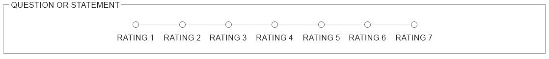
- Odd number of options. 5 or 7 points. Five is the sweet spot (sufficient granularity and low cognitive load). Seven works for a large audience of experienced users, but reduces response rates.
- Verbal labelling of all options. Avoid numbers without labels — respondents do not know where 1 (very bad) or 5 (very good) is.
- Symmetry and balance. The number of positive and negative gradations must be equal relative to the neutral middle.
Example of a "crooked" (unbalanced) scale: "Bad / OK / Good / Great / Awesome". Here there is only one negative point, three positive ones, and a neutral "OK". Such a skew forces users to choose a positive answer even with an average impression, artificially inflating the overall score.
What else to avoid: more than 7 options — excessive; options like "I don't know" — that is not a neutral position but a refusal to answer; they should be used separately or not at all.

Where to embed the scale in documentation
Optimal placement locations:
- At the end of each topic (most common).
- At the end of a section consisting of several screens (e.g., after a "Getting Started" chapter).
- A floating widget "Rate this page" (mini‑survey in the corner of the page).
Do not place the scale in a modal that pops up immediately when the page loads — it irritates users and drastically reduces response rates.
How to process and interpret the data
The most frequent mistakes made by beginners: treating the scale as interval (computing arithmetic means) and ignoring modal values.
- Median and mode are preferred measures of central tendency for ordinal data. Calculate the percentage of respondents who selected each point.
- Visualisation — histograms or stacked bar charts. Ideally show trends after documentation improvements.
- Statistical significance — if you have fewer than 20 responses per section, any conclusions will be unstable. A decent response level is achieved with 50+ ratings.
A practical approach: create a dashboard with topics on one axis and the percentage of positive answers (somewhat helpful + completely helpful) on the other. A topic scoring below 70% is a candidate for rewriting.
Segmentation: user role and documentation type
An important nuance rarely taught: usefulness ratings can differ dramatically depending on who reads your text. Segment data at least by two dimensions:
- User experience. Beginners often give low ratings to basic‑concept sections (if poorly explained), while experts rate advanced topics or contextual cues. Without segmentation, you won’t know for whom the document is unclear.
- Documentation type. For API reference, users expect precise signatures, short examples, and fast search — a "neutral" rating may be acceptable. For step‑by‑step tutorials, a neutral rating already signals a lack of clarity or excessive complexity. Segment by topic type (reference / tutorial / troubleshooting); otherwise aggregate statistics will mislead you.
Technically, this means adding hidden metadata to each rating request — for instance, user role (if known via authentication) or a section tag. In Google Analytics 4 you can pass these as event parameters (user_role, doc_type).
Technical implementation: from widget to analytics
For the Likert scale to become a quality management tool, data must flow seamlessly into your analytics system. In 2026, the standard is to use the GA4 event model or dedicated endpoints.
1. Sending Data via Google Analytics 4
For accurate tracking in GA4, it is recommended to send both a numeric value (for median calculations) and a string value (for readable reports). Using the navigator.sendBeacon method ensures that data reaches the server even if the user closes the tab immediately after clicking.
// Function to send feedback rating


    function sendDocFeedback(rating, label) {


     const eventData = {


     'event': 'doc_feedback',


     'page_path': window.location.pathname,


     'rating': parseInt(rating), // Numeric value (1-5)


     'rating_label': label, // String value ("Helpful")


     'user_role': window.userRole || 'guest' // Additional context


    };


    // 1. Push to dataLayer for GTM


    window.dataLayer = window.dataLayer || [];


    window.dataLayer.push(eventData);


    // 2. Fallback via sendBeacon (if you have your own API)


    if (navigator.sendBeacon) {


     const blob = new Blob([JSON.stringify(eventData)], {type: 'application/json'});


     navigator.sendBeacon('https://api.yourdomain.com/v1/feedback', blob);


     }


}Important: in the GA4 interface, you must register rating as a Custom Metric. This allows you to plot average and mode charts directly in Explorations.
2. Implementation specifics for HAT systems
The method depends on how "closed" your publishing environment is:
- MadCap Flare & Adobe RoboHelp: The script and scale markup should be placed in Master Pages (or Layouts). Use HAT system variables (e.g.,
[%=Topic.Title%]) to automatically pass the article title to thetopicparameter together with the rating. - Dr.Explain: Since the system generates clean static HTML, use the HTML snippet mechanism. You can create one global snippet with the handler script and insert it into the export template (footer), and add the scale itself as a text variable or fragment at the end of each page.
- Cloud platforms (ClickHelp, GitBook): Check for native integrations. If their functionality is insufficient, use Custom JS injection, but keep in mind CORS policy — your analytics server must allow requests from the help domain.
3. Hybrid approach with forms
If you do not have access to corporate analytics, the fastest path is to connect the scale to Google Forms. Each scale option is a pre‑filled URL link. When clicked, the data goes to a spreadsheet, and the user sees a brief "Thank you for your feedback" in a new tab.
Technical tip: to avoid data noise, configure throttling so that a single user cannot submit 100 ratings for the same page within a minute, skewing section statistics.
Connecting to documentation improvement metrics
Systematic collection of Likert ratings lets you turn qualitative improvements into KPIs. For instance: "After reorganising the introduction, the share of positive ratings rose from 45% to 78% over the quarter." That is a strong argument in discussions with management.
Limitations of the method
- Focus on isolated topics. The scale does not show why a user gave a low rating (wordy text, complex terminology, errors). Combine with an additional free‑text field: "What could be improved?".
- Wording standardisation. Different users may interpret "mostly helpful" differently. You can reduce variability by providing clear instructions.
- Low response rates. In documentation, response rates rarely exceed 1‑2%. Encourage responses by light visual highlighting and promising that feedback will be taken into account.
Research from 2025 confirms that while a simple star rating is easy to give, it often fails to capture the detailed feedback present in user comments, highlighting the value of any additional qualitative data we can collect.
According to recent industry analysis, large language models (LLMs) like BERT and GPT are expected to play a transformative role in this area. Their advanced sentiment analysis capabilities allow for a much deeper understanding of user sentiment, going beyond simple positive/negative classification to grasp nuances like sarcasm or mixed feelings.
Despite its limitations, the Likert scale is the most convenient trade‑off between detail and ease of collecting feedback in help systems. You can start by embedding a 5‑point scale at the end of key topics, and after a month you will already have direction for your first optimisation.
Practical takeaway: do not expect magic from the Likert scale in the form of a ready‑made edit plan. Use it as a primary filter for problem areas that you then investigate more deeply (interviews, search query analysis, navigation logs).
Future outlook: AI-powered analysis of open‑ended comments
While the Likert scale provides numerical direction (e.g., "the installation section scores low"), it rarely explains the reason behind the rating ("why is the installation section problematic?"). This is where the integration of AI agents and Large Language Models (LLMs) offers a game‑changing opportunity for documentation teams in 2026.
Instead of just collecting scores, you can start combining the Likert scale with a simple open‑ended question: "What would make this topic better?". An LLM (such as GPT-4o, Claude, or DeepSeek) can then automatically analyze free‑form comments in real time. It can cluster feedback into categories (e.g., "missing screenshot", "unclear terminology", "outdated command"), perform sentiment analysis of the textual responses, and even generate a short weekly summary for the technical writing team. A study from 2025 found that LLM‑driven sentiment analysis significantly surpasses baseline methods, yielding improved accuracy and actionable insights, especially in challenging and context‑rich scenarios [6].
Several Help Authoring Tools are already moving in this direction: ClickHelp has introduced an AI‑powered insights dashboard, and cloud platforms like GitBook are experimenting with smart feedback triage. Even static site generators can integrate this via third‑party services such as CustomGPT or API calls to open models. The key takeaway is not to replace the Likert scale, but to augment it. Use the scale as a high‑level filter, then let AI help you dive into the qualitative details — turning passive readers into active partners in quality, at scale.
To summarize, the Likert scale is far more than a cosmetic addition to your help pages. It transforms vague user sentiment into ordinal data that can be tracked, segmented, and acted upon. However, its true value emerges only when combined with thoughtful design (balanced options, clear labels), proper segmentation (by user role and documentation type), and robust technical implementation (event tracking via GA4 or dedicated backends). Remember that a Likert score indicates where a problem exists, but not why. Therefore, use it as a first‑pass filter to flag underperforming topics, then follow up with qualitative methods (user interviews, search logs, or free‑form comments). When applied correctly, a simple five‑point scale becomes an indispensable compass for continuous documentation improvement — turning passive readers into active partners in quality.