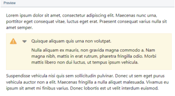
The preview panel displays what the text block will look like with the current settings. The block looks and behaves (e.g. for Spoiler template) the same way it does when exported in HTML.
Here you can select a template to apply its settings to the current text block. You can use the standard templates or create cutom ones. To override the template's settings for the current text block only, check the option in the corresponding section.
In the text block template editing mode, instead of the list of available templates, a text field with the template name is displayed in this section.
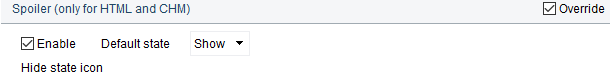
Use this section to enable collapsing/expanding behavior for the block content. Such behavior is assigned to the Spoilerstandard template. Here you can configure the default state of the text block: collapsed or expanded.
In collapsed state, only the first paragraph of the text block's content is displayed.
Collapsing/expanding text block is supported when exporting to HTML and CHM. In other formats the text block content will always be expanded.
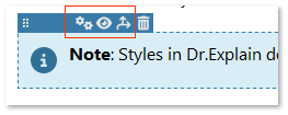
 to open the text block settings dialog at the Main settings tab.
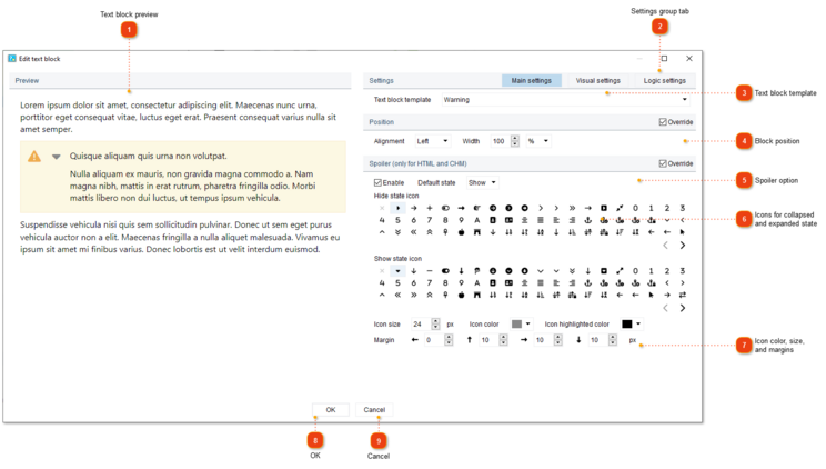
 option in the corresponding section.
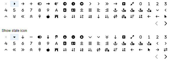
 to navigate across the icon list pages.
