


Publication date: .
Nielsen and Norman emphasized in their usability heuristics (the 10th principle) that good documentation is critically important for how users perceive the entire system. Reference documentation has long ceased to be a "last resort" or a "workaround for complex software." It is now a second interface that shapes the emotional connection between the user and the brand. In this article, we'll explore how that connection is built, which techniques work (and which don't), and why ignoring user documentation is too costly.
Cognitive transfer effect: pure psychology
Cognitive transfer is a phenomenon described in the work of Daniel Kahneman (Nobel Prize in Economics 2002). It means that people tend to extend their evaluation of one attribute to the entire object. For example, a user types "export data" into the help system search and gets no results because the documentation uses the word "extract." They conclude that either the search is useless or the documentation is outdated – and ultimately abandon the product. The evaluation of a single attribute (poor search) spreads to the whole object (the product).
Importantly, cognitive transfer works for both successes and failures. Negative experiences are remembered more strongly – this is called "negativity bias." One bad interaction with documentation can outweigh three good ones.
In 2026, documentation is often the first point of entry into a product. A user searches for a solution online, and if your help content ranks better than your landing page, it's the documentation that forms their first impression of your brand. Heading structure (H1, H2) and the use of search queries ("how to set up X", "error Y") in the text are direct drivers of organic traffic. Don't treat help content as a closed library – it's a public marketing channel that must be optimized for real user pain points.
Psychological mechanisms: empathy, consistency, autonomy
How users interact with documentation directly triggers deep psychological processes. Three key mechanisms – empathy, consistency, and autonomy – can either build trust and loyalty or cause frustration and rejection. Let's examine each one.
Empathy and error anticipation
The best help guides don't just describe actions – they anticipate user difficulties. Instead of "Click Save," write: "Before saving, make sure all fields marked with an asterisk are filled in; otherwise, the data will not be recorded." This approach reduces cognitive load and shows that you care. The user subconsciously thinks: "These people thought about me."
A scenario where this fails: excessive empathy – when every action is accompanied by a long warning, it annoys especially experienced users. The solution is conditional content or sections labeled "For beginners" / "For experts."
How Apple II documentation created the PC market
In the late 1970s, computers were associated with huge mainframes or hacker kits. When Steve Jobs and Steve Wozniak created the Apple II, they faced the challenge of explaining to ordinary people why they needed a computer at home. Instead of dry technical specifications (typical ring‑bound folders with circuit diagrams), Apple released the "Apple II Reference Manual" – a book with lively language, plenty of white space, and intuitive graphical metaphors. Complex concepts like memory architecture were explained through simple imagery. The documentation didn't just tell you which button to press – it gently introduced you to programming and home computing. As a result, the Apple II was no longer seen as "geek hardware" but as a friendly home appliance. This move laid the foundation for Apple's user‑centric DNA.
Consistency as a signal of stability
When terminology, heading structure, button styles, and warning placement repeat from page to page, users spend less effort orienting themselves. This creates a feeling of monolithic reliability. Breaking consistency (e.g., "Next" in one place and "Continue" in another) introduces chaos. Users lose confidence in what will happen after they click.
Another enemy of consistency is "walls of text." Solid paragraphs half a screen long, with no subheadings, bullet points, or visual separators, force users to scan the page for the right fragment. This increases cognitive load and creates a sense of chaos. Even a precise instruction gets lost in dense formatting – users simply don't read far enough to reach the important step. Simple rules: break long paragraphs, use lists for steps, and bold key words. Consistency applies not only to terminology but also to the visual rhythm of the page.
Hidden complexity: maintaining consistency in large documentation requires discipline and tools. Without a single source of truth and style checking, different authors inevitably create drift. HAT tools (MadCap Flare, Adobe RoboHelp, Dr.Explain) help through global variables and templates, but they don't completely solve the human factor problem.
Autonomy and reducing frustration
Most users prefer to find answers on their own rather than contacting support. A high‑quality knowledge base gives them a sense of control and competence. People feel smarter – and transfer that feeling to the product. Poor documentation, on the other hand, causes helplessness and anger, which then get projected onto the brand.
This is especially critical for high‑cost B2B products. A client who cannot navigate your help system after implementation will initiate a refund or cancel the contract. The total cost of ownership of such "savings" on technical writers ends up being huge losses.
When does user documentation harm the brand?
A bad help system can destroy trust even if the product is technically excellent. Here are the most common mistakes.
Internal jargon without explanation
Using terms like "configurator," "property," "handler" for users unfamiliar with code is a direct path to irritation. Jargon creates a barrier, making people feel inadequate. "Showing off" never works in user documentation. Exception: when you're writing for a professional audience (developers, sysadmins) where such terms are the working language. In that case, segment the audience – give each group its own version of the knowledge base.
Outdated screenshots and instructions
Help content that describes an interface from a year ago kills trust instantly. The user sees a blue button on the screen, but the documentation shows a red button. Their conclusion: "The team isn't maintaining the product. So they won't fix bugs either." Updating screenshots should be integrated into the development process (e.g., via auto‑generation from mockups).
No search or poor search
When a user enters a query and gets no relevant results because the help system uses different words – that's a failure. Search must support synonyms and word forms. Client‑side (JavaScript) search is inefficient for large volumes – you need server‑side search with ranking. Ignoring this makes documentation nearly useless for large projects.
Ignoring accessibility (WCAG)
Documentation that doesn't meet accessibility standards not only loses users with disabilities but also damages brand reputation. Moreover, in many jurisdictions (EU, some US states), non‑compliance carries legal risks and fines. For example, the European Accessibility Act (EAA) requires digital product manufacturers to ensure accessible documentation.
Broken localization and machine translation without editing
Cognitive transfer often fails when entering international markets. If a user sees the interface in their native language but the help content is carelessly translated (calques from English, mismatched cases), the feeling of care disappears. Users interpret this as: "You care about our money, not our comfort." Localized documentation must be equivalent to the original in depth and style. Without a native‑speaker review, the "helper" becomes a source of irritation.
Processes and responsibility
Technical perfection of tools is useless against bad processes. The industry's biggest pain is lack of ownership. Without a designated content owner, documentation inevitably becomes outdated. Best practice: include documentation in the team's Definition of Done (DoD). A feature is not complete until it's documented.
The Blue Screen of Death example from Microsoft
In the 1990s, Windows was associated with instability, and the BSOD (Blue Screen of Death) was its main symbol. The error text was a hexadecimal memory dump – documentation written by engineers for engineers. Ordinary users saw a threat and felt helpless. Starting with Windows XP, and then more thoroughly in Windows 8, Microsoft radically redesigned this piece of contextual documentation: they shortened the text, removed scary jargon, added plain human language (the famous sad smiley :( ), and later added QR codes that linked to specific knowledge base articles.
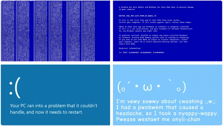
The product no longer looked "hostile." Users no longer felt guilty for the system error. This change in microcopy helped Microsoft reduce technological stress for millions of people.
The mistakes we've listed are valuable material for an audit. But it's even more useful to look at those who turned documentation from a source of problems into a strategic asset. Let's examine two models – reactive and proactive – and examples of companies that elevated documentation to a brand level.
How companies shape product perception through user documentation
In the IT industry, attitudes toward user documentation fall into two radically different philosophies:
- Reactive approach (documentation as "firefighting"). The company creates instructions only because "it's required" or to keep regulators and angry users at bay. Documentation is written after the fact: after the product has changed, broken, or support has been flooded with similar complaints. This is a defensive, passive stance.
- Proactive approach (documentation as care and a sales tool). The company understands that high‑quality help content is a full‑fledged part of the product and the face of the brand (like Apple's packaging). Instructions are written in advance: so that users never encounter a problem in the first place, easily complete onboarding, and quickly realize the product's value. This is an active stance of managing customer experience.
The table below shows how these two philosophies differ:
| Parameter | Reactive approach | Proactive approach |
|---|---|---|
| Updates | Once a year, after user complaints | With every release, synchronized with code (CI/CD) |
| Search | Client‑side, basic | Server‑side, with synonym support and query analytics |
| Tone | Impersonal, feature listing | Task‑oriented, with elements of care |
| Metrics | None – evaluated "by eye" | Tracked: helpfulness feedback, time‑to‑answer, churn during onboarding |
| Brand impact | Negative or neutral | Increases loyalty, reduces support load |
In practice, companies rarely fall strictly into one column. Let's look at three examples of the proactive approach.
Stripe – documentation as the primary marketing tool
Stripe made its documentation the face and main unique selling proposition of the product. They created interactive, "live" documentation with a two‑panel interface where you can test API requests directly from the browser. For this, they developed their own markup format called Markdoc, which separates logic from content – unlike old monolithic platforms where code and text were mixed. The result is a clean, logically segmented interactive environment. Diagrams and examples clearly show the request flow (Client → Stripe → Server), allowing developers to grasp the architecture almost "off the page."
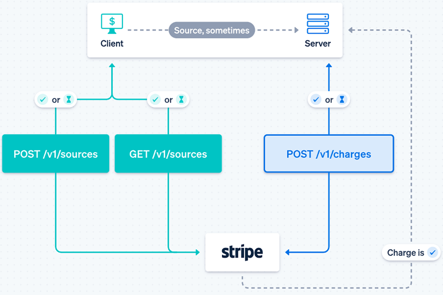
Effect: 68% of developers who successfully run a code example go on to integrate into production, and 80% of all new Stripe integrations happen without any support contact. The product became perceived as the most advanced, cleanest, and most developer‑friendly. What can you learn from Stripe? Make the time to first working example (Time to Hello World) your main documentation metric (Stripe achieves minutes, not hours) and add interactive elements like programming language toggles.
Django – documentation as an open‑source project manifesto
While most open‑source projects expected users to read the source code or rely on sparse wikis, Django offered a comprehensive, structured guide and an extremely detailed API reference. The philosophy: "batteries included" – everything you need comes in the box. In 2007, Django's co‑founders wrote "The Definitive Guide to Django" and released it for free, which was almost revolutionary at the time.
Fun fact: inspired by the quality of Django's documentation, a computer science graduate named Eric Holscher came up with Read the Docs. Once, while reading Django documentation lying on his couch, he realized that documentation could be engaging, not boring. "I found the transformative power of documentation – it turns the unknown into the understandable," he recalls.
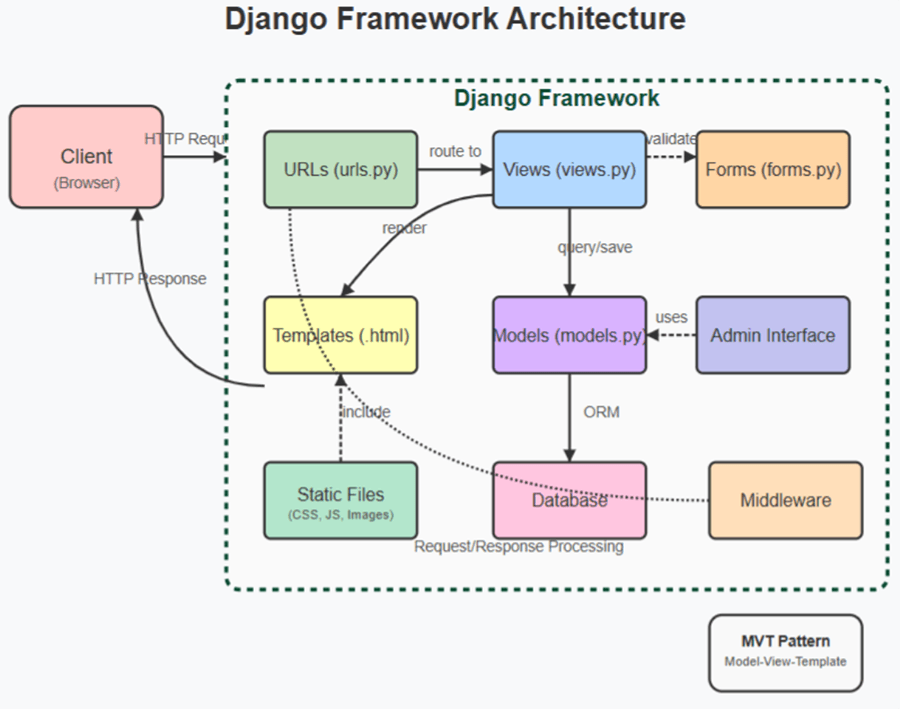
Django's documentation immediately welcomes users with end‑to‑end tutorials. Clear architecture diagrams explicitly show beginners how urls.py, views.py, and templates relate to each other. The perception of Django shifted from "yet another geek tool" to "a reliable industry standard." According to a StackOverflow survey, Django is used by 14.2% of developers, while Ruby on Rails is at only 7%.
Notion – documentation as a premium element and community cult
In 2015, Notion was on the brink of survival – nearly all funds were spent, and the product was raw. The founders fired almost the entire team and moved to Kyoto to rewrite the product from scratch. Their unconventional method: Notion didn't write documentation itself – it created a community that wrote documentation for it. The first ambassador and community lead, Ben Lang, joined the company after launching his own Notion template gallery on Product Hunt.
Today, Notion is valued at $10 billion, and their marketplace hosts tens of thousands of community‑created templates. What can you learn from Notion? Build an ecosystem around your documentation – a gallery of templates, use cases, and real‑user stories. Don't try to write all the documentation yourself: launch a partner or ambassador program, let power users create content.
What do Stripe, Django, and Notion have in common?
All three companies didn't just "write documentation." They made it distinct. Here's a summary table of their strategies and specific levers you can apply today:
| Company | Main success metric | What they did with documentation | Key influence lever | What you can do tomorrow |
|---|---|---|---|---|
| Stripe | Time to Hello World (5 minutes) | Made documentation interactive (Markdoc) | Lowered entry barrier, automated sales | Add a programming language toggle to your code examples |
| Django | Percentage of successful newbie onboarding | Created "batteries included" philosophy, open book | Lowered entry threshold to textbook level | Write a first‑person "Hello, World!" guide |
| Notion | Community activity (number of templates) | Delegated content creation to the community | Built a cult around the product | Start a "Scenario of the Month" blog section |
Hybrid approaches and hidden complexities
You don't have to choose strictly between "reactive" and "proactive." Many companies use a hybrid model: core documentation is created in a HAT (single source of truth), with personalized views for different audiences via conditional content.
Hidden complexity: analytics of documentation usage. What queries are users searching for and not finding? Where do they get stuck? Without this, blind improvements can actually harm perception. Solution: implement server‑side search with logs or integrate Google Analytics 4 with custom events.
AI tools and RAG: documentation becomes a conversation
In 2026, text‑based instructions are giving way to conversational interfaces. Retrieval‑Augmented Generation (RAG) technology allows you to connect a language model to your documentation corpus. Users ask questions in natural language and receive answers synthesized from relevant articles. The quality of the source documentation becomes even more critical: language clarity, semantic structure, and absence of jargon are now required for AI assistants to work well. Companies like Adobe and Cisco already use vector search across their documentation, reducing response time tenfold.
When documentation cannot save the product
Even perfectly written help content cannot fix a product with fundamental UX problems. If a simple action takes five clicks, documentation will only highlight that flaw. First redesign the interface, then improve the documentation.
How to measure documentation success
For managers, numbers matter, but shallow metrics (views, time on page) are often misleading. A more honest approach is to measure how quickly users achieve a goal using your documentation. For example, measure the average time from opening the help content to successfully completing a target action for a group of new users, then improve the documentation and measure again. The comparison will show real value.
Practical recommendations for technical writers
- Run usability tests on your documentation. Observe how real users search for information. The best format is "5 tests with typical tasks."
- Use single‑sourcing tools. Word and Google Docs don't scale. HATs provide reusability and CI/CD support.
- Collect metrics. Start simple: "Was this material helpful?" (yes/no) buttons at the end of topics, then move to a Likert scale.
- Sync with your release cycle. Best practice: Docs‑as‑Code – a repository, CI validation, and automated builds.
Quick documentation audit: 3 key questions
- User language: Do article titles match real search queries? If users search for "export to Excel" but the article is called "Extract to XLSX" – that's a problem.
- Screenshot freshness: Do the buttons and elements in the screenshots match the current product version? If the interface changed but screenshots didn't – trust drops.
- Search accuracy: Does the search return relevant results for 10 typical queries? Are synonyms and word forms handled?
If you answer "no" to at least two of these – your documentation is very likely harming product perception. Start with these three questions; they give the highest return on time invested.
Conclusion
User documentation is an active participant in customer communication. It shapes the impression of the product no less than interface design or support service. Cognitive transfer, empathy, and consistency are scientifically grounded tools that work – but they require discipline, the right tools, and metrics. Investments in professional HAT tools and processes usually pay back within 6–12 months through reduced support costs and increased customer retention.
Start with an audit of your current documentation: run three simple tests with real users. The results will likely surprise you. Then build a roadmap – from content structuring to advanced search and analytics. Only then will documentation stop being a "workaround" and become your competitive advantage.